Sett documentation and guidelines
Tables
A table is a container for displaying data efficiently. It has built-in pagination and allows users to quickly search, scan, sort, compare, and take action on data.
Best practices
Tables should:
Be accessible and intuitive to navigate for users who interact with Badgr via assistive technology like screen readers.
Allow for filtering and sorting.
Help users visualize and scan many values from an entire data set.
Offer users ways to find more information through the use of text links.
Minimize clutter by only including data and values that support the current workflow of the page.
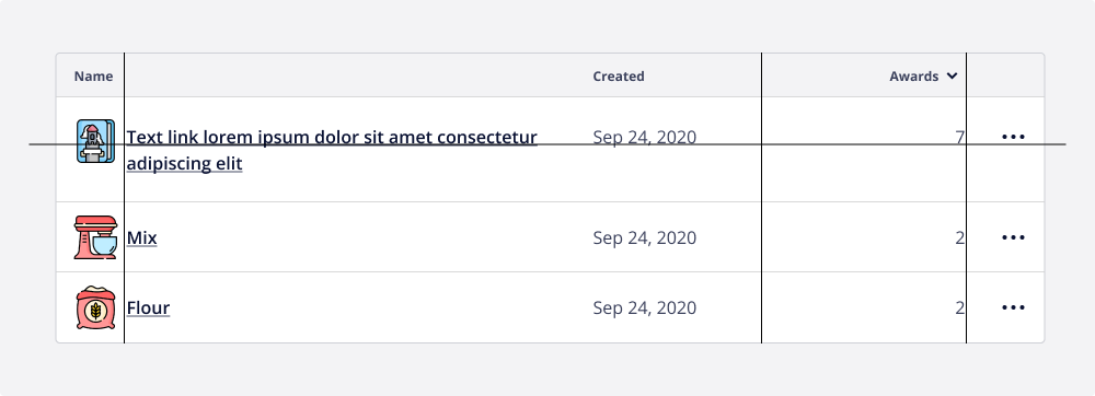
Wrap instead of truncate content. If row titles start with the same word, they’ll all appear the same when truncated.
Not to be used for an actionable list of items - only static content or links.
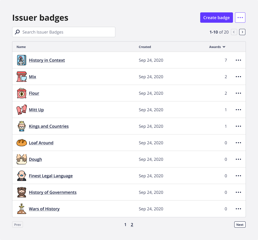
Paginate when the table contains more than 10 rows.
Content
Reference the Badgr Content Guide when implementing tables.
In general, header and column content should:
Be informative and descriptive.
Concise and scannable to avoid text wrapping.
Use sentence case (the first letter of sentence capitalized, the rest lowercase).
Anatomy
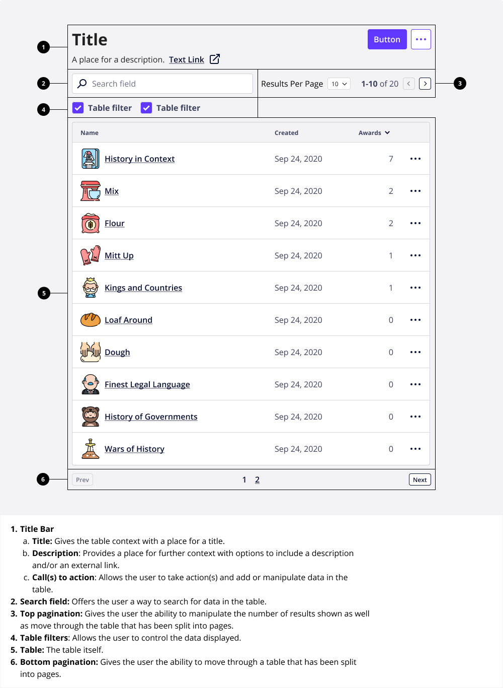
Tables can deploy up to six parts:
Title Bar
Search field
Top pagination
Table
Bottom pagination
Accessibility
For users who interact with Badgr via assistive technologies like screen readers, tables should give the user the ability to:
Move across each row.
Move down each column.
Move diagonally from cell to cell.
Interact with a form element.
Interact with an overflow menu.
Accessible labeling
Use an aria-label to help users understand a table’s intention when accessing a table via assistive technologies.
aria label practices:
Use an aria-label if the visible text doesn’t adequately convey the intent of the content in a cell.
Use an aria-label if the cell has no text and relies on an icon or image alone somewhere else in the table to convey the content (i.e., the overflow menu column header doesn’t have a text label).
Use aria-labels to read the column header first, then the table cell.
Hide decorative icons and images from screen readers. They are read back to users as “image,” which can be misleading.
Alignment
The following alignment rules should be followed:
Right-align numerical data.
Left-align textual, image, iconographic data, as well as form elements.
Align headers with their related data.
Don’t center align content across rows. When the content of one cell wraps onto multiple lines, line up any additional content on the top baseline.
Responsive behavior
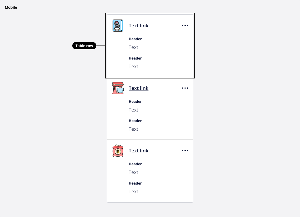
The table utilizes a modified layout for each table row for smaller viewports, such as mobile devices.
For smaller viewports (mobile devices), when there is not enough room for the content in the table, the table rows take on a different layout that stacks content and superimposes the table headers into each row.
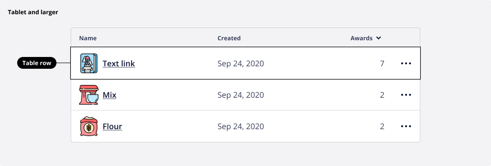
Larger viewports (tablet and larger) display tables in the traditional way.
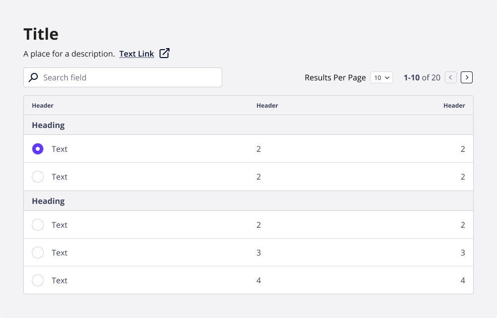
Row grouping
Table data can be grouped together with an optional heading to give context to the grouped rows.